
Filed under: Art and Design at University, Art Progress | Tags: canvas painting, mixed media, mixed media art, painting process, stop motion animation, under the camera animation, whimsical artwork
Today I had a go at under the camera stop motion animation creating a piece of artwork. It was meant to be for my final piece in Animation at Uni, but I think I will count this one as a practice and have another go next week. Hope you enjoy!
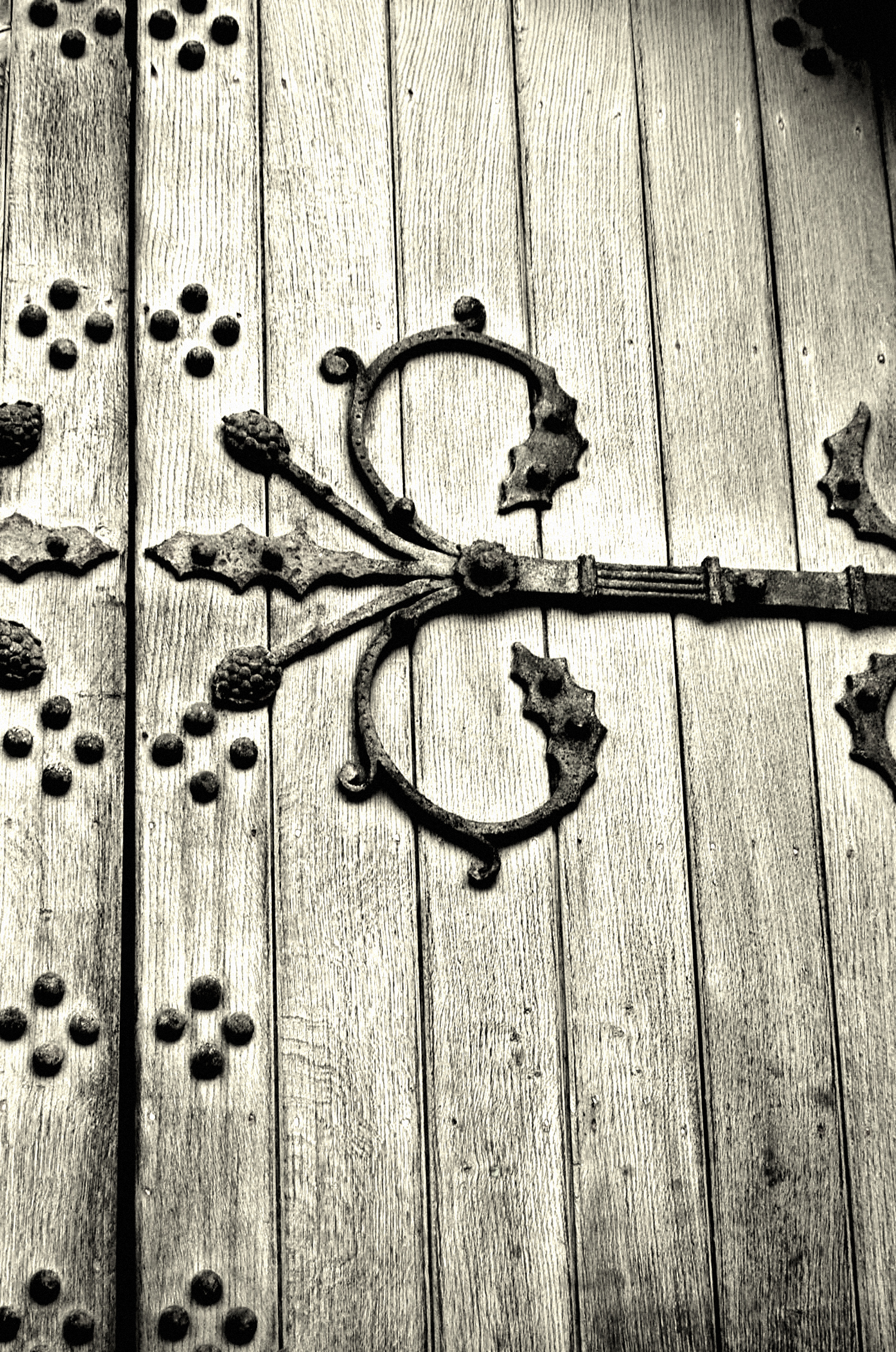
Filed under: Art and Design at University, Art Progress | Tags: Alphabet challenge, Art and Design Wolverhampton, Black and White alphabet, black and white photographs, C letter, Giffard Arms Pub, Giffard wolverhampton, wolverhampton church, wolverhampton city centre, wolverhampton university, X letter
Hi there!
Today I have been working on one of my University projects, which is to find the letters of the alphabet in places. It can be anything that has not intentionally formed the letter, but you can see the letter in it.
I went into Wolverhampton early this morning and decided to go letter hunting. The project sounds quite easy but I found it quite hard to find a lot of letters – finding simple curved letters like O and C was easy and got more than one, but I struggled to find harder letters with more shape such as Q and B.
While hunting for letters, I found my love for Wolverhampton again. It has been nearly over a year since I moved from there and I realised how much I miss it today. Here are a couple of photographs I took this morning.

The church

Giffard Arms Pub
And here are a couple of letters I found on the way! I still have a few to find, but enjoying the process. The final piece is to make them all into a poster. I am definitely going to stick to a black and white theme!
Letter E, found on Church door.

Letter X, found on old shop
Filed under: Art and Design at University, Art Progress | Tags: art process, cat print, dry point printing, etching printing, intaglio, intaglio printing, wolverhampton uni of art and design
Here’s another dry point print, this time of my Cat Izzy when she was a kitten. I have used red ink as well as black this time. Firstly I did a black print, then I experimented a little with the red and black colours. I have done Izzy as a ‘joker’ and one of her red with a black nose.
Apologies for the awful photographs, they are taken with my mobile phone! I just had to share them. I am really enjoying the process of intaglio printing and I can’t wait to do more!


Filed under: Art and Design at University, Art Progress | Tags: art and design, Art progress, Artwork, dry point printing, intaglio printing, printing, printing process, wolverhampton university
I thought I would share my first experiences trying out dry point printing at University. When etching my first design on plastic (below) of me and my partner Jamie, I didn’t think that the results would turn out as well as they did. I loved the whole process of dry point printing – I found it a lot easier than screen printing and lino printing, but the results were great. I can’t wait to experiment more.

First four prints I did
Above, I first printed the ones that don’t have much shading, as it was my first attempt I didn’t know where to apply most of the ink, but then gradually added a bit more to make the print more effective (below.)
For the process, I wet the paper (so the print can be made) and rubbed oil based ink into the etch on plastic. I then rubbed away the excess ink and added shading with it where needed. I then placed the etching board down and put the damp paper on top. I then put them through the rolling machine, and taped down to dry.

Close up of print.

Butterfly prints
I enjoyed the process so much I decided to do another one. Above is an etch from a photograph I took of a butterfly. I used the same process as above but this time experimented with tissue paper to add colour. As you can see, the print on the right did not turn out as well as I’d have liked, because the tissue paper moved in the printing process.
I will be doing lots more dry point printing next week, and can’t wait to show everyone the results. I am really looking forward to experimenting more with this way of printing, and hopefully putting some in my shop!
Filed under: Art and Design at University

A lot of people often say that Warhol’s 1964 silkscreen painting of Elizabeth Taylor (below) represents her in a tacky way that she looks like a transvestite or a clown. This is the opinions of people that take a quick glance at it, that do not look into the deeper meanings as to why Andy Warhol used Liz as a subject in the first place, and who she was as a person, not just as an Actress.
Warhol painted a lot of famous people in the 60’s, taking advantage of the celebrity culture swarming America, on which you could say he could be thankful for his career. It is easy to assume that the reason for Warhol’s celebrity obsessions was merely because he could sell more paintings, but I think there was a deeper reason behind him using the subjects he did. If you look at the women that Warhol silk screened, they are all independent and glamorous, women like Marilyn Monroe, Blondie, and of course, Elizabeth Taylor.
However, I do believe that Warhol’s reasons for using Liz as a subject were more than her celebrity status. In the 60’s, Elizabeth was at the height of her fame, and was the highest paid actress when she landed a role in ‘Cleopatra’ which earned her 1 million dollars; an excessive amount of money back then. Unknown to most that during this time Elizabeth was in and out of hospital with Pneumonia, and it was so bad that on one occasion she had to have an emergency tracheotomy. She had always battled with her health. Something that not a lot of people know about her is that she was born with Scoliosis, an abnormal curvature of the spine, a life changing illness that in her later life, she couldn’t escape. All in all Elizabeth was in and out of hospital all her life and had over 100 operations. Due to all this bad health, she still continued to be that glamorous, independent woman that Hollywood adored, and I believe that this is one of the reasons why Warhol was so fascinated with her. Not just because she was famous, because she was a brave woman, never letting her illness show; as well as independent and glamorous.
I believe Warhol admired Elizabeth for her great work as an actress, despite the constant health battles, which is why I think he chose the vibrant colours in the screen prints. Deep down, this painting of Elizabeth depicts 2 sides to the actress. The one the public knew, and the one the public didn’t. The vibrancy of the colours used in this silk screen painting says to me that Warhol wanted the public to depict Elizabeth as a head strong, powerful, brave and glamorous. The fact that he named the piece ‘Liz’ a nickname, not her full name ‘Elizabeth’ also adds the personal side to her that Warhol was showing us through his work.
These are my interpretations of the relationship between the pair, and my personal thoughts on the painting. I feel that now I have looked into it a bit more, I empathise with Liz, and admire how well she coped with her bad health when being such a huge star. Having neurological health problems myself, I especially admire how she built a life of success in a career she loved.
